Somewhere in Berlin, in 1704, a paint maker made a mistake. The result was a color so vivid and so permanent that it would, more than a century later, fundamentally transform Japanese art and give Katsushika Hokusai the exact tool he needed to paint one of history’s most famous images. This is the story of Hokusai Prussian blue history — an accidental invention that crossed continents and changed everything.
Today, we look at The Great Wave off Kanagawa and see an iconic deep blue. Most of us assume this blue is somehow essentially Japanese, rooted in centuries of tradition. In reality, it was a German industrial accident less than 130 years old when Hokusai painted it. And that fact makes the story far more interesting.
What Is Prussian Blue and Where Did It Come From?
Prussian blue is a synthetic pigment — one of the first stable synthetic pigments ever created. Its chemical name is iron(III) hexacyanoferrate(II), and its deep, vivid blue-to-indigo hue made it immediately valuable the moment it was discovered.

The Accident in Heinrich Diesbach’s Laboratory (1704)
The story begins with a Berlin paint maker named Johann Jacob Diesbach. In 1704, while attempting to make a red pigment using potash he’d borrowed from alchemist Johann Konrad Dippel, Diesbach found that the potash was contaminated with animal oil residues. The chemical reaction produced not the red he expected, but an intense, deep blue.
This accidental blue was named “Preußisch blau” — Prussian blue — after the Kingdom of Prussia where it was first produced. By 1724, the synthesis process had been published and the pigment spread rapidly across Europe. Artists immediately recognized its advantages: it was cheaper than the traditional lapis lazuli blue, more stable than smalt (glass-based blue), and far more vivid than indigo.
European painters adopted it quickly. By the mid-1700s, it was in widespread use across the continent. Gainsborough used it in his portraits. Constable used it in his skies. But its most dramatic artistic impact would come much later, and much further east.
How Prussian Blue Reached Japan by the 1820s
Japan during the Edo period operated under the sakoku policy — strict limitations on foreign trade and contact with the outside world. Only Dutch traders were permitted to operate, through the small artificial island of Dejima in Nagasaki harbor. This tiny bottleneck became the channel through which Prussian blue entered Japan.
Dutch merchants brought Prussian blue to Japan, where it was called Berorin Ai (ベロリン藍) or simply Bero Ai — a phonetic corruption of “Berlin Indigo.” In Japanese commercial shorthand, it became simply bero or bero ai. Some historians date its widespread commercial availability in Japan to around 1820–1829, though it may have arrived in limited quantities somewhat earlier.
Japanese artists immediately recognized its potential. The color was unlike anything previously available in the ukiyo-e palette. Traditional Japanese indigo (ai, derived from the Indigofera plant) was softer and more muted. Prussian blue was vivid, electric, and — crucially — completely stable under different lighting conditions. It didn’t fade or shift the way many organic pigments did.
The Chemistry That Made Bero Ai So Useful for Printmakers
For wood-block printmakers, pigment stability was critical. A print might be made in editions of hundreds or thousands, requiring consistent results across many impression runs. Prussian blue held its color reliably. It was also water-soluble, making it perfect for the water-based ink system used in Japanese wood-block printing.
Additionally, Prussian blue could be diluted to produce a wide range of blue-to-green tones. Mixed with yellow, it produced vivid greens. Diluted heavily, it created the soft blue-gray sky tones that became characteristic of many 1830s prints. This single pigment gave printmakers a new spectrum of cool tones they’d never had access to before.
Why Hokusai Prussian Blue History Changed Ukiyo-e Forever
By the time Prussian blue became commercially available in Edo in the 1820s, Katsushika Hokusai was already in his 60s — an established master who had been producing woodblock prints for over four decades. He embraced the new pigment immediately and used it with extraordinary creativity.

The Iconic Blue of The Great Wave
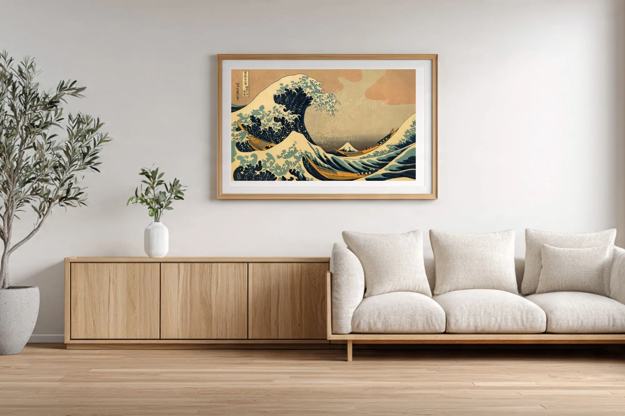
When Hokusai designed The Great Wave off Kanagawa — the first print in his landmark series Thirty-Six Views of Mount Fuji (c. 1831) — he built the entire composition around Prussian blue’s dramatic potential.
Look at the wave itself. The deep, almost black blue at the crests isn’t a traditional Japanese color at all. It’s Prussian blue at near full concentration, creating a depth and weight that no pre-existing Japanese pigment could have achieved. The foam at the wave tips — those distinctive claw-like fingers of white water — were created by leaving areas of the paper unprinted, which makes the surrounding Prussian blue appear even more intense by contrast.
The sky behind the wave shifts from deep blue-gray near the horizon to a paler tone at the top, achieved by diluting the Prussian blue with water. This graduated sky was a printing technique called bokashi — and the availability of Prussian blue made the full range of tonal variation possible in a single color run.
Mount Fuji appears almost white-gray at the center of the composition — deliberately small, deliberately calm. Hokusai understood that placing the quiet mountain against the violent blue wave created a visual drama that made both elements more powerful. Prussian blue was the dramatic foil that made this work.
The Series That Defined an Era: Thirty-Six Views of Mount Fuji
The full Thirty-Six Views of Mount Fuji series shows how thoroughly Hokusai integrated Prussian blue into his visual language. Nearly every print in the series uses the pigment as a structural color — not just as sky or water, but as a unifying element that ties the compositions together visually.
At the time of publication, the Japanese public was captivated. The vivid blues were unlike anything they’d seen in ukiyo-e prints. Contemporary viewers would have recognized Prussian blue as a “new” color — part of its appeal was its novelty. Hokusai wasn’t just using a good pigment; he was surfing a wave of public fascination with a foreign import. The new blue felt exciting, modern, slightly exotic.
The commercial success of the series drove other publishers and artists to adopt Prussian blue. Within a decade, it had spread through the entire ukiyo-e industry. Utagawa Hiroshige used it extensively in his Fifty-Three Stations of the Tōkaidō (1833–1834). What Hokusai had pioneered quickly became standard practice.
Color Fading: Why Original Prints Look Different Today
Here’s a detail that surprises most visitors to museum exhibitions: the Prussian blue prints we see today in museum collections are often significantly different from what they looked like when first published.
Prussian blue is highly stable in terms of chemical decomposition — it doesn’t react with other pigments or with the paper substrate. However, it is sensitive to light exposure over long periods. Extended exhibition under strong lighting causes the pigment to fade from its original deep blue toward a greenish-gray. Additionally, other pigments used alongside Prussian blue have their own fading profiles, which means the color relationships Hokusai intended have shifted over 190 years.
Original first-edition prints in excellent condition (held in low-light museum storage) can show markedly different color saturation than the faded reproductions often used in books and postcards. The “correct” version of The Great Wave is significantly more blue — almost aggressively blue — than most reproductions suggest.
This fading dynamic is part of why ZenLine Atelier’s approach of digitally restoring original color states is historically significant: it attempts to reverse the effects of time and recover what Hokusai’s audience actually saw in 1831.
Prussian Blue vs. Traditional Japanese Indigo: A Critical Comparison
| Property | Traditional Indigo (Ai) | Prussian Blue (Bero Ai) |
|---|---|---|
| Origin | Plant-derived (organic) | Synthetic (iron compound) |
| Hue | Soft, muted blue | Deep, vivid blue-indigo |
| Light stability | Fades relatively quickly | Very stable, slow fade |
| Cost (1820s) | Moderate | Cheaper per unit of saturation |
| Tonal range | Limited when diluted | Wide range from dilution |
| Best use in printing | Flat washes, textiles | Graduated tones, complex water/sky |
Hokusai’s Legacy and the Prussian Blue Wave That Followed
The impact of Hokusai’s Prussian blue work extended far beyond Japan. When Japanese woodblock prints began arriving in Europe in large numbers after 1854 (following Commodore Perry’s opening of Japan), European artists were immediately struck by their bold color, especially the blues.
Vincent van Gogh was an avid collector of Japanese prints and wrote extensively about them in his letters to his brother Theo. He specifically studied how Japanese artists used flat areas of strong color — including vivid blues — to create atmosphere and emotion without modeling or shadow. The influence is visible in his own use of deep blues in works like The Starry Night.
Claude Monet’s garden at Giverny — including the Japanese bridge that appears in so many of his water lily paintings — was partially inspired by his collection of Japanese prints. The bridge series paintings show Monet’s deep engagement with the same water-and-reflection themes that Hokusai explored with Prussian blue.
In a sense, Prussian blue’s journey is complete: a German accident became a Japanese sensation, and then Japanese prints brought their blues back to Europe where they sparked an entirely new movement in Western painting.
Summary: Hokusai Prussian Blue History and Its Permanent Mark on Art
The Hokusai Prussian blue history is a story of globalization before globalization — of how a synthetic accident in 18th-century Berlin eventually gave a 60-year-old Japanese print master the color he needed to create the most reproduced artwork in history. Bero Ai traveled from Berlin to Japan through a colonial trade bottleneck, landed in the hands of a restless genius, and became the defining tone of an artistic revolution.
When you look at The Great Wave, you’re seeing chemistry, history, trade, and genius all mixed in a single color. That blue carries more stories than most people realize.
✦ The Blue That Changed History — Now in Your Home ✦
ZenLine Atelier’s digital prints restore Hokusai’s Prussian blue to its original, unfaded intensity — the blue his Edo audience actually saw. High-resolution digital download. Print at home or at a professional lab.
